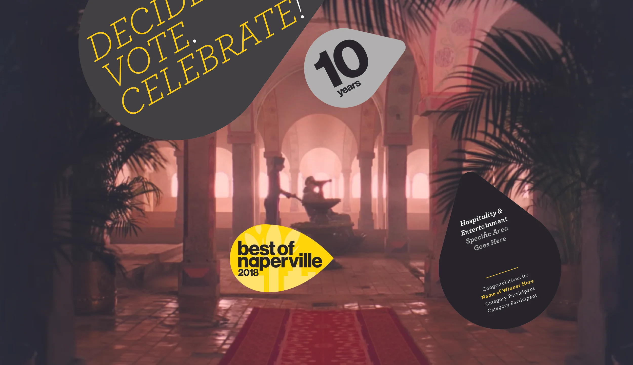
In their decade long anniversary, Naperville Magazine wanted to redesign the visual identity of their biggest event of the year—where they celebrate the “Best of Naperville.” Best of Naperville is a festive dinner ceremony where the best local businesses in over 40 categories are selected. The logo redesign is bold, modern and more cheerful while paying tribute to the heritage of the community’s flag which is composed of three leaves that root from a tree and expand outwardly to make up the town. The signature leaf housing the wordmark is accompanied by similar shapes that dynamically contour the curve of the leaf, but feature a rounded treatment to assimilate a spotlight instead of coming to a sharp point like the leaf. Marketing materials were created for all platforms of communication to accompany this new visual language. A suggested sequence for the event is also featured to encourage the brand message forward by incorporating visually striking footage from popular pictures. https://napervillemagazine.com/best-of/